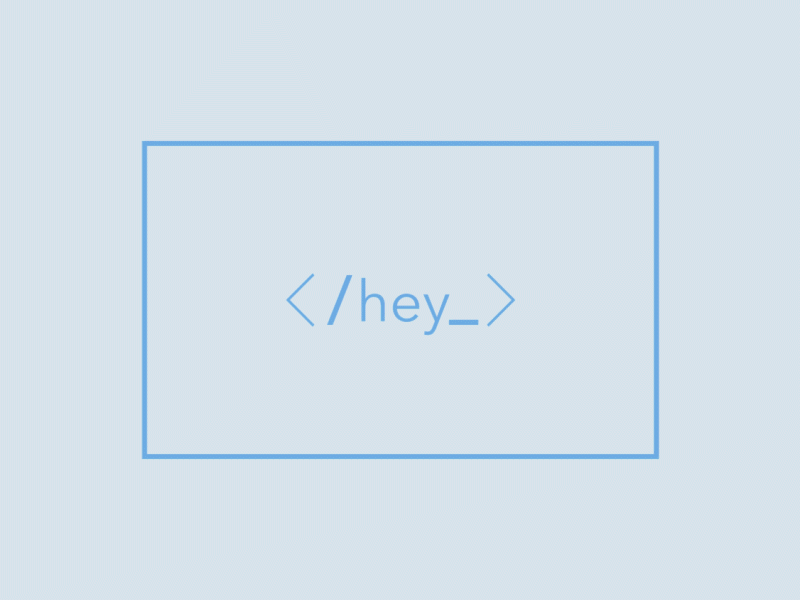
What Happens When You Test AI Against Real Creative Work
So I decided to stress test this new AI tool called Weavy AI. The real question I wanted to answer was pretty simple: can it actually recreate the animated service icons I made for a client about 15 years ago? And not just vaguely copy them, but match them properly ,same standard, same colours, same branding approach, same animation style, timing, size, and even format if possible.
The reason I went down this rabbit hole wasn’t just curiosity (although there was definitely some of that). I genuinely wanted to see if there’s any real risk of AI coming for our jobs, or if it’s mostly hype. And at the same time, I wanted to understand where the useful stuff actually is, what it’s genuinely good at, where it shows promise, and where it still falls apart.
There’s a lot of noise and not much clarity out there when it comes to AI tools, so this was really just me trying to cut through the fluff, learn a new skill with Weavy AI, and see what I could realistically get out of it. And, if I’m honest, to see whether it could come anywhere near the design quality I’d expect from myself.
The Gig
Take these animated icons I made for a client and try to recreate something in the same style, and automate the production.

To break it down, each of these icons had its own concept and storyboard. Every shape and movement has a reason, the style is slightly abstract, and each one has its own meaning.
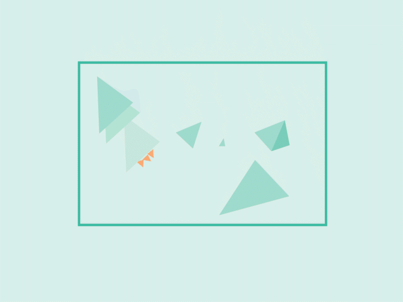
Step 1 - Reference
If you’ve ever created graphic-based work for a brand, you’ll know you always start with some kind of frame of reference. At the most basic level, that might just be a written treatment. But usually it goes further than that, reference imagery, bits of work that spark something, a certain feeling, moodboards, animatics… anything that helps shape the art direction and communicate it to someone else.
It’s really the combination of all these things that creates a unique approach to art direction. Something that works with the concept and the brand. And that’s always the goal, to create something that actually feels distinctive.
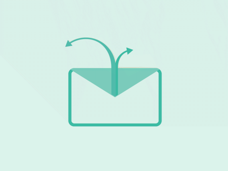
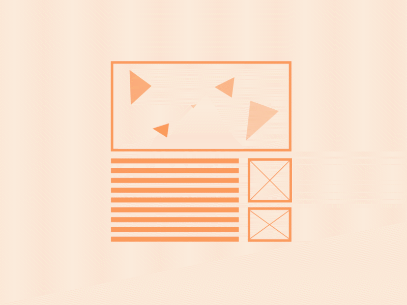
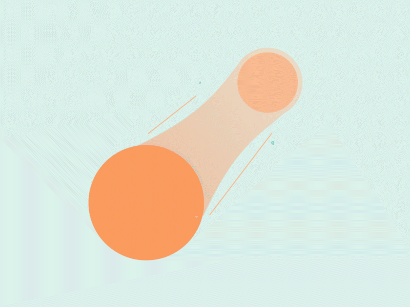
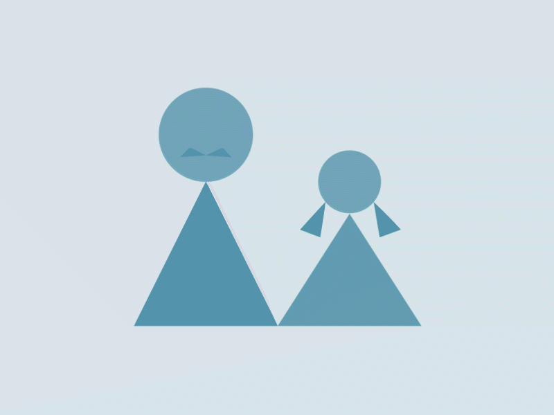
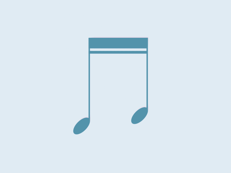
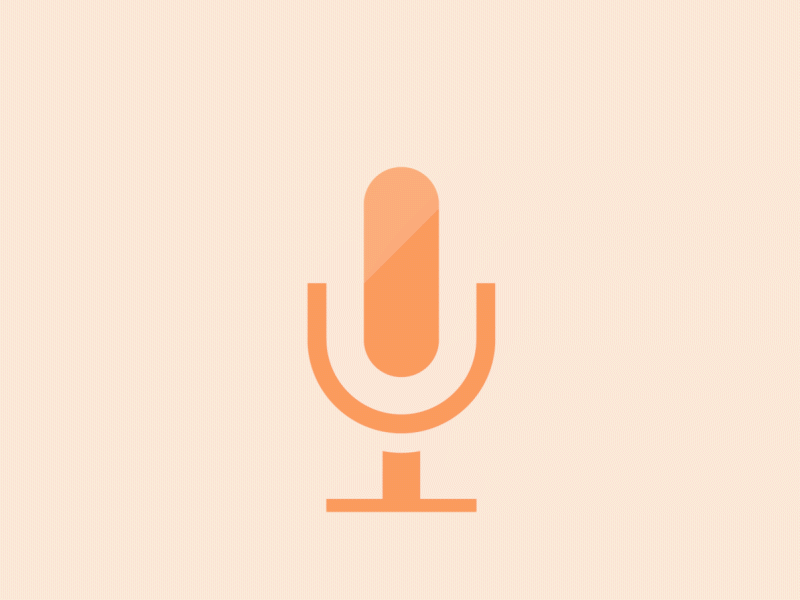
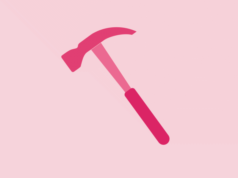
So with that in mind, I chose these four icons as my frame of reference, as they each gave enough visual and movement information for the AI to understand what it needed to create.
Each image provides guidance on colour, shape, layout — all the things a designer would automatically think about.
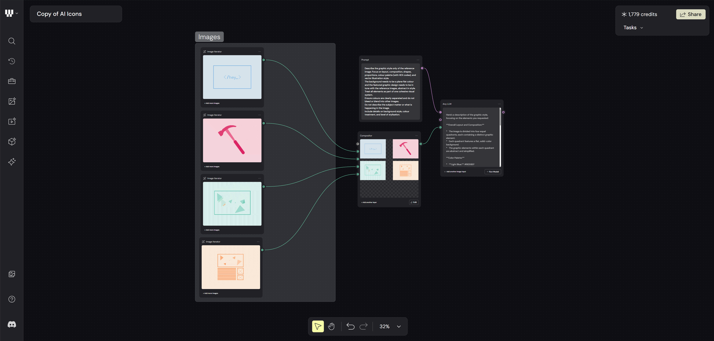
Alongside that, I used an “Any LLM” (Large Language Model) node to describe the images. In this case I used Google Gemini 2.0, but most language models would work just as well.
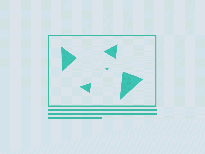
Step 2 - Image Creation
The next step was image creation, based on the references. Weavy AI actually has a really solid range of options for this, you can just plug into tools like Higgsfield, Flux, Reve, and Stable Diffusion without needing separate subscriptions for all of them. For this test, I went with Nano Banana Pro, based on a bit of research.
Through a mix of LLM nodes and prompt separators, I was then able to guide the AI to create a new set of themed icon designs based on those original references. The idea was to generate something comparable, and then stack the results up against the original animated icons I’d created, just to see how they really held up.
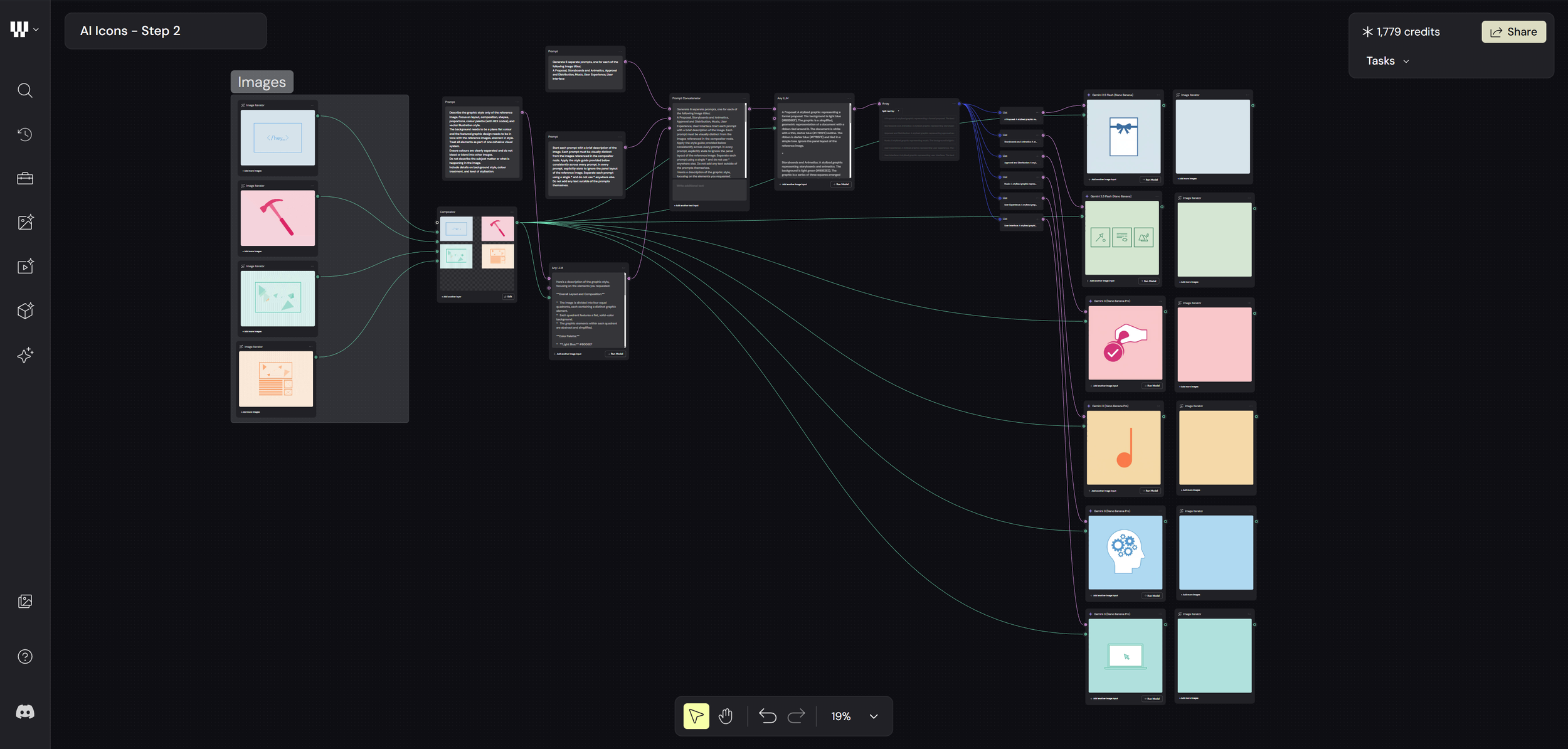
Guiding Prompt: ‘Generate 6 separate prompts, one for each of the following image titles:
A Proposal, Storyboards and Animatics, Approval and Distribution, Music, User Experience, User Interface’.
After a few runs of the generator and tweaking the guiding prompts, I settled on the images you see here. These were then stacked up, with a separate frame next to them that would act as my starting frame for the animation.
Step 3 - Animating
The next step was getting these animated. I gave the AI guidance on how the icons should move, keeping them true to their subject and trying to build a bit of a narrative around each one. I was relying a lot on verbal descriptions of motion, basically trying to explain how I’d animate them myself. Some of it was straightforward, but some of it definitely wasn’t. The hardest part was describing the subtle nuances of movement, especially because those details are quite specific and a big part of what makes them feel unique.
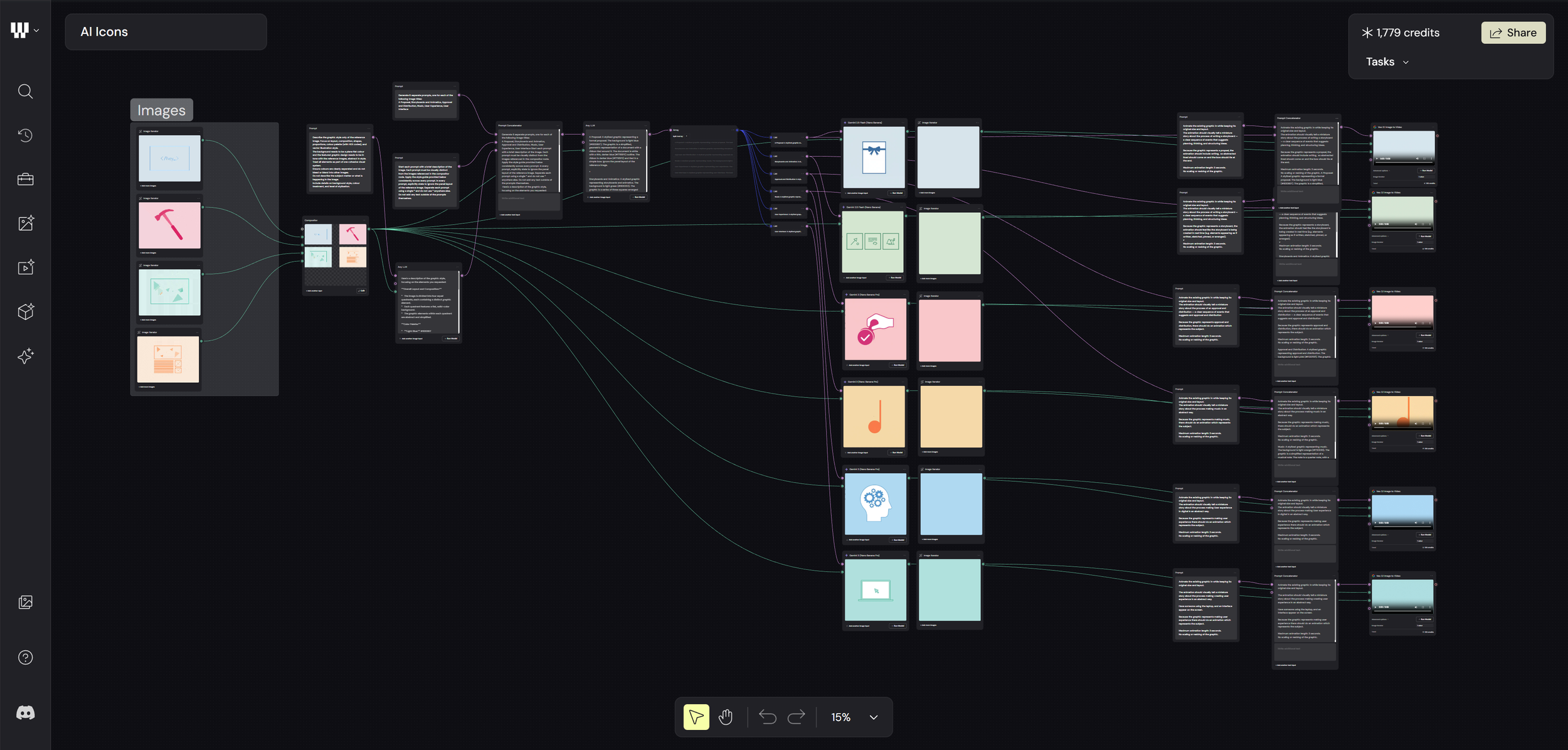
I used Veo 3.1 for the image-to-video part, which works well, but annoyingly you’re stuck with either 16:9 or 9:16.
The Results
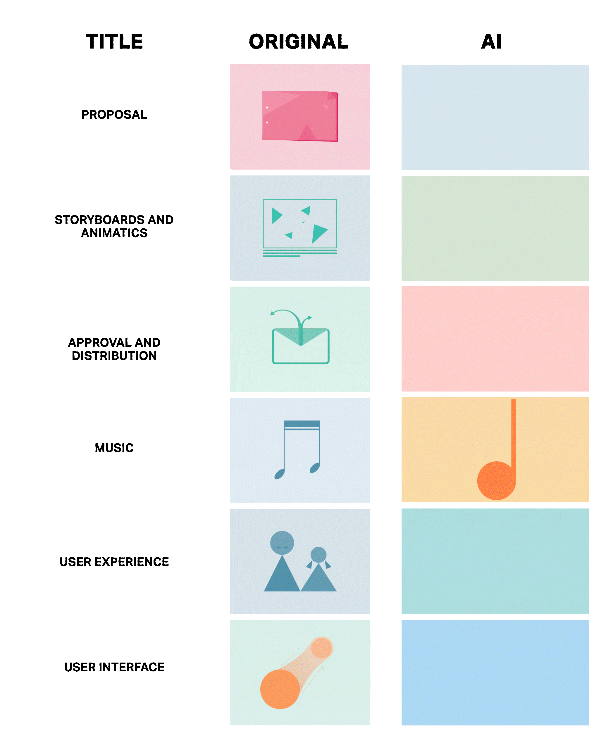
The original animated icons have a really refined style that links them all together as a branded set. It’s all about the subtle nuances, movement accents, shape, colour, opacity, all working together to form a clear design language. Each one tells its own story and moves in a way that communicates what it’s meant to represent.
Whether it’s the prompting, the AI model itself, or the references I used, it’s pretty clear the AI didn’t pick up on that. One of the main issues for me is colour. Even after repeatedly providing exact hex codes, it still got them wrong. Cropping was an issue too, along with animations that just didn’t make sense.
But the biggest problem is that there’s no real design language connecting them. They don’t feel like part of the same brand. They lack a consistent look and feel, and for me, that’s kind of the whole point.
One of the key takeaways from all of this is that, yes, it didn’t actually take that much time, and you can definitely see the potential in setting up design systems inside a node-based tool like Weavy. If it eventually gets to a point where it truly understands branding at that level, it could become a really powerful way to expand on ideas and push work into production.
It’s still early days, but this was a solid exercise in seeing what’s realistically possible right now. At the moment, AI is clearly great at some things and not so great at others. But it’s moving fast, so watch this space. In a year’s time… who knows?